When I got to college, I decided to get into good habits and keep a thorough history of my
spending. I started writing it down, but that got tedious, and I ran out of space. So then I
started making spreadsheets. Over the next two years, I created something
similar to the app Mint, except I micro-managed everything, and it doesn't connect to my
bank account.
The end goal of the project was to come up with this kind of pie graph:
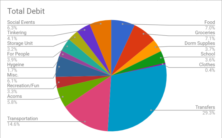 I also connected it to SMS,
so I can text a number to get recent history, current balance, and the chart.
So now the details!
It starts off as a Google form. I put in the date of the transaction, where/who,
category, whether it's debit or credit, and the amount of the transaction. I chose the
categories myself, and they are customizable. I based the categories off my personal
spending goals and habits.
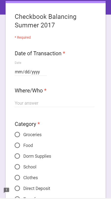
This information is connected to a Google spreadsheet called "Responses". The
spreadsheet gets a new row each time there's a new form submission, which is how Google
forms work. I used Google Apps Scripts and created a script that would sort the
submissions
by the date of transaction whenever the spreadsheet was opened. This is in case I submit
transactions out of order, or I have to delete one.
Then, I have a separate spreadsheet called "Checkbook Processing". I wrote another
Google Apps Script that automatically copies the data from "Responses" into this
spreadsheet when this one opens, so the data is auto-populated.
Then the complicated mess begins. I have a section for each category that will look to
see what the category is, and it will add up how much I spend in that category. Here's
an example:
 Note: I froze the left
side in order to make them constantly visible, which is why the letters at the top don't
follow alphabetical order. In this example, the
column "Food Status" looks for what's in row D. If it's "Food", it looks for what's in
row E. If row E is "Debit", it will write what's in row F. "Percentage Food" divides the
total amount I spent on Food with how much I spent
in total. "Food Status Total" sums it all up.
I have three columns similar to this for every single category, and I automated it all
with spreadsheet formulas so that it automatically populates with data every time the
spreadsheet opens. The formulas are in place for a large number of cells, let's
say until row 500. Then, I take the all the totals from row 500, and I have a formula
that takes those values and puts them in a different sheet that compiles of all my
totals into a table.

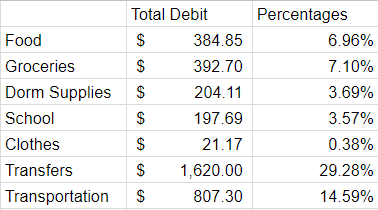
Then, I make the pie chart based off the data in that table!
The beauty is that the data populates itself. Granted, I do have to submit a form every
single time I pay for something, but still. Better than writing it all out.
I'm currently in the process of making this more mobile-friendly instead of having to go
on a computer to input and view all the results. Right now, I can text "Chart" to my
Google Voice number, and I have a script setup so it will text me the picture
of the pie chart. I also have it setup so I can text "Hist", and it will text me the
last 5 entries I put in, in case I'm submitting forms on my phone and I forgot what I
entered in last.
 I also connected it to SMS,
so I can text a number to get recent history, current balance, and the chart.

 Note: I froze the left
side in order to make them constantly visible, which is why the letters at the top don't
follow alphabetical order. In this example, the
column "Food Status" looks for what's in row D. If it's "Food", it looks for what's in
row E. If row E is "Debit", it will write what's in row F. "Percentage Food" divides the
total amount I spent on Food with how much I spent
in total. "Food Status Total" sums it all up.
